
Typographic poster case study
Project Title The Shade Experience
Audience People of all ages that are interested in historic African fashion
Overview
This project focused on designing a purely typographic exhibition poster for a historical designer. Without using any imagery, the poster explores expressive layout through contrasts in scale, weight, and texture. Informed by research into the designer’s era and typographic styles, the final design presents the exhibition details in a bold and engaging format.
Objectives Demonstrate familiarity with page layout and typesetting conventions
Experiment with legibility and readability using type and letterforms
Demonstrate professional typographic solutions
Softwares Used Adobe Illustrator
Adobe InDesign
Adobe Photoshop
Deliverables Exhibition poster (trimmed to dimensions, no crop marks)

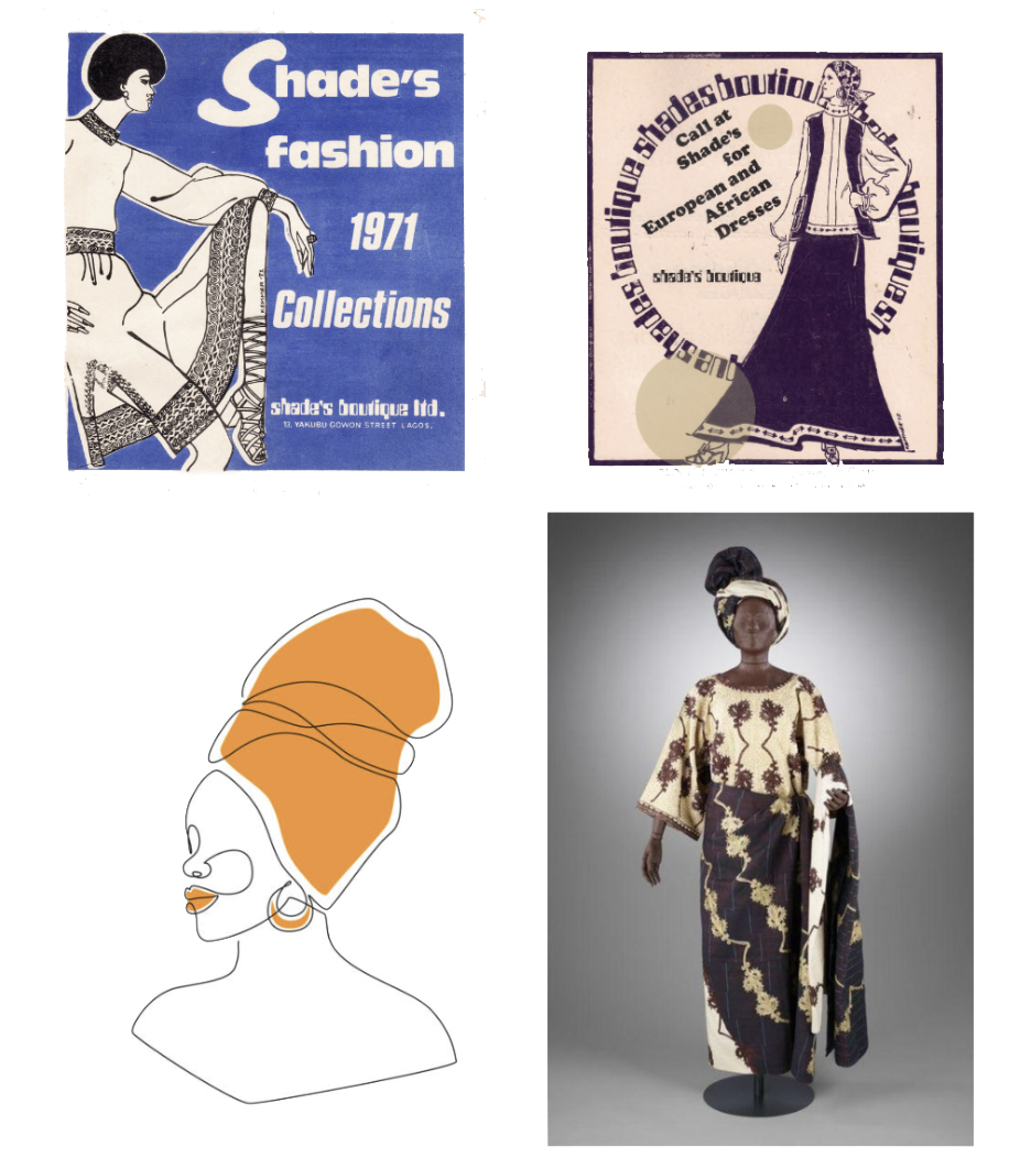
Through research, I discovered that Shade Fahm was one of the most influential designers in Nigeria, known for creating ready-to-wear versions of traditional clothing. Archival exhibition posters were looked at during research, with attention to their font styles and layout. Additional inspiration was drawn from traditional Nigerian garments and a variety of other typographic posters. This research informed the design direction and helped get started on rough thumbnails to begin visualising initial concepts.
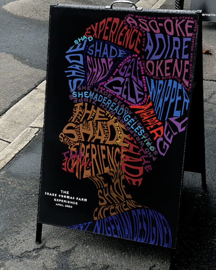
Shown here are some of the more refined thumbnails that received positive feedback. There was a bit of deliberation when it came to the exhibition title—whether to use the designer’s full name, surname, or first name. Ultimately, The Shade Experience was chosen for its personal and memorable tone. The bottom-center thumbnail was selected as the final direction due to its simplicity and its ability to effectively convey the cultural essence, incorporate elements of one of Shade Fahm’s actual designs, and subtly reference the designer herself.
I started the process with initial brainstorming to map out key ideas and determine a clear approach to the project. Inspired by my personal roots in Nigeria, I wanted to focus on an African designer. Colour choices were carefully selected to reflect my identity as well as traditional clothing. Typographic hierarchy was needed to meet the project objectives and ensure that key information remained clear and legible. Elements of the designer’s iconic clothing silhouettes could also be incorporated to create a more personalised and meaningful visual connection. This helped me get started on research and figure out who the chosen designer was going to be.


The selected thumbnail was developed further in Adobe Illustrator, where custom shapes were created to establish the foundational structure for text placement. Using the Type on a Path and text wrap tools, typography was integrated into the design, replacing the shapes to form a cohesive composition. The text was composed of words associated with the designer’s work, along with the exhibition title. Hierarchy was given through variations in colour and scale to highlight key terms—ensuring that, even if not fully legible, viewers could quickly identify important keywords that convey the essence of the exhibition.
On the left are some of the colour studies and variations I explored to find a combination that not only looked visually appealing but also reflected Nigerian culture. I originally planned to use a green background, but it didn’t work well with the overall design. In the end, I chose a black background for the final poster, as it felt more connected to traditional clothing and culture, and it provided a strong contrast that made the colourful typography stand out. The colours used in the type were inspired by the bold patterns often seen in Shade Fahm’s designs, helping to bring energy and personality to the poster.
I believe the final outcome was successful, as it met the project’s objectives and effectively used type and letterforms to communicate the theme. I spent time testing legibility and readability, and whenever something didn’t work visually or conceptually, I looked for professional, design-based solutions. This project taught me how challenging it can be to capture a designer’s essence using only typography—but with focused research, a clear understanding of the designer’s work and context, and a thorough design process, I was able to find solutions that brought the concept to life.


