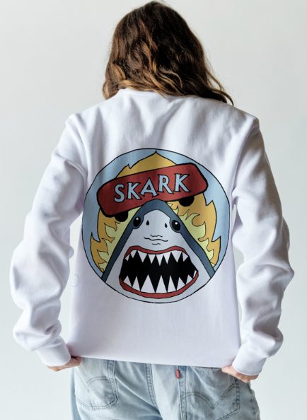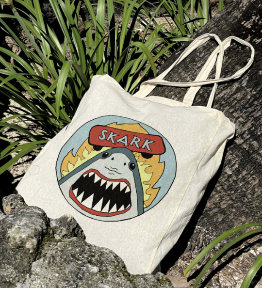
skark -
skate shark
This skate logo is inspired by bold, iconic brands like Toy Machine and Santa Cruz, known for their edgy, memorable visuals. The "Skark" design features a front-facing shark with its mouth open, sharp teeth exposed, and a skateboard balanced on its nose, all set against a light blue background with dynamic orange and yellow flames. Created with flat shapes and pastel hues, the logo maintains simplicity while incorporating subtle asymmetry, such as the off-center skateboard and uneven flames to add energy and movement. The blue background is echoed in the typography for visual unity, while complementary colors create high contrast and appeal. Sharks symbolize qualities like strength, fearlessness, and agility, all traits associated with skateboarding. Designed to work across apparel, stickers, and accessories, the logo aims to resonate with a wide, gender-inclusive audience while staying visually impactful and brand-ready.