Album cover + Tour Poster
case study
Project Title Join The Band
Audience Rap and Rock music listeners
Overview
Identify a band and clearly define their target audience to guide the creative direction. Develop a cohesive album rollout that includes an album cover, tour poster, ensuring all designs are visually engaging and aligned with the band’s brand. Focus on strong layout, typography, visual hierarchy, and legibility throughout.
Objectives
Softwares Used Procreate
Adobe InDesign
Adobe Photoshop
Create a campaign for an artist that includes an album cover and tour poster
Band, artist, tour and/or album may be a real or fictional
Identify your band & their target audience, with focus on layout, typographic and visual hierarchy, and legibility
Deliverables Album Cover
Tour Poster


This project was particularly engaging, as it allowed me to take on a more client-based approach. A friend of mine, Daniel, an independent musician, asked for help designing an album cover, and I saw it as a great opportunity to align it with this assignment. In our initial conversation, he shared his vision: a central eye motif that appears tired and looks upward, with a psychedelic aesthetic and elements inspired by infrared or x-ray visuals. His music, and his overall persona carry a dark, gritty energy, which I used as a foundation during my brainstorming and research to ensure the final design reflected his style and sound.

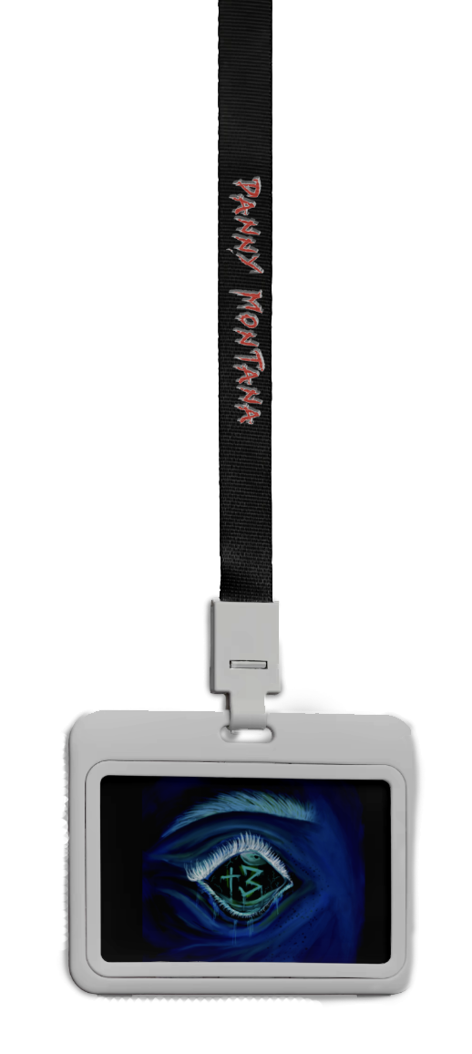
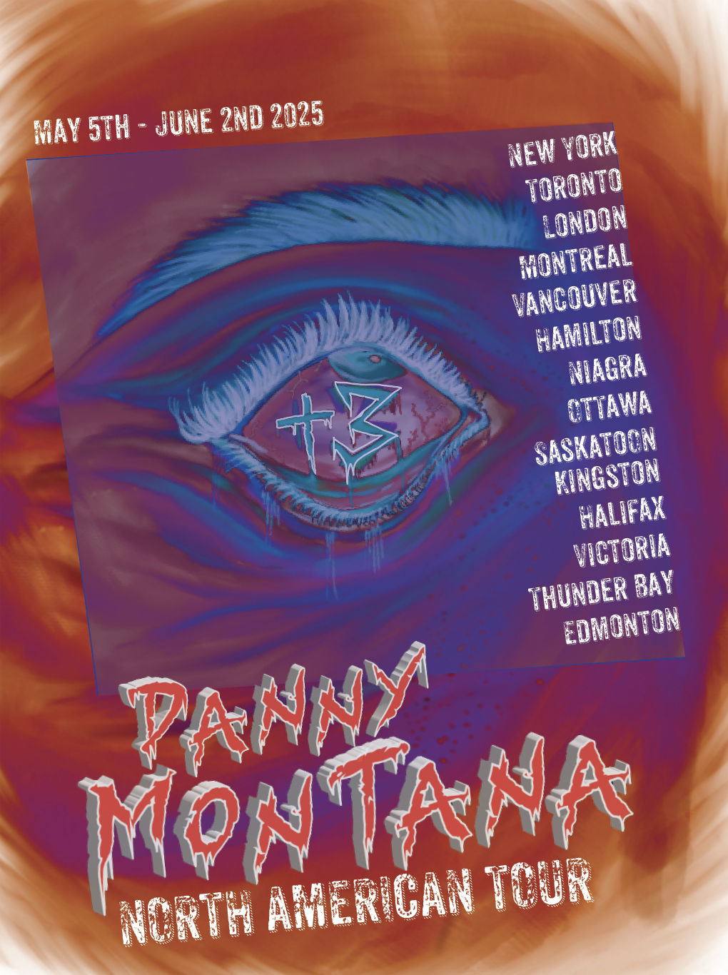
During the research phase, I explored posters and album covers with a similar aesthetic, and Daniel selected a few that resonated most with his vision, giving me a solid visual direction to build on. I aimed to create a strong visual connection between the album cover and tour poster without making them identical. To achieve this, I chose the upturned eye as the central, recurring element, or hero image across both designs, that could also be used for potential merchandise. He also requested that the album title, +3, be incorporated into the design.
I then began sketching out layout ideas and potential imagery for both pieces, using a photo of my own eye looking upward as a reference as seen below. From there, I digitally illustrated the eye and placed the album title within the pupil to reinforce its prominence.


Once the hero image was finalized, I moved into Photoshop to experiment with effects that would reflect the neon and infrared aesthetics the client had in mind. Several variations were created, each exploring different treatments to capture that psychedelic feel. While the tour poster worked well with just the eye as the focal point, the album cover felt like it needed an additional element to make it more dynamic. To enhance it, I experimented with merging a photo of Daniel with the eye illustration, creating a layered composition that added depth while still aligning with the overall concept.


Shown above are the experiments combining the eye illustration with Daniel’s portrait. After sharing the results, he gave positive feedback, expressing that the outcome perfectly captured the vision he had in mind.


On the left are the main colours used to achieve the infrared/x-ray aesthetic that Daniel requested, along with the chosen typeface he preferred for the poster. On the right are the two final deliverables: the album cover, featuring the merged visual of the eye and portrait, and the tour poster, which highlights the eye as the central element alongside concert-related typography.
Overall, I believe the project was successful as the client was pleased with the results, and the initial objectives were met. Throughout the process, I learned a variety of photo manipulation techniques and enjoyed exploring this particular visual style. Working with a live client provided valuable experience, it gave insight into the challenges of interpreting a client’s vision. I found that offering a range of experiments and visual options made communication more effective and helped keep the project aligned with their expectations.